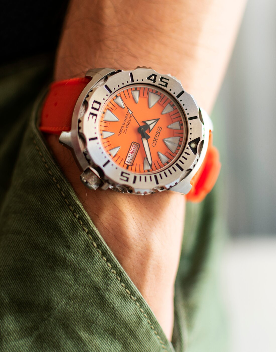
Today, the Monster is a well-known, beloved and, dare I say, iconic watch from the Seiko line-up. It’s arguably one of the best and most recognizable designs from the brand, along with the Samurai, in the past couple of decades or so. But this was not always the case. When the aptly named Seiko Monster SRP309 first appeared on the market, it was one of the most polarizing watches in existence – many loved it, but many more absolutely hated it. And I was in the latter camp.
Its full metal construction made it look almost too tool-like. The shroud for the bezel and the deep bezel grooves only contributed to its ugly appearance and the aggressive, oversized hour markers and hands, along with the bright orange dial, made the overall looks impossible to stomach. What was Seiko thinking when they designed this abomination and, more importantly, what was wrong with all those people singing the praises of their hideous Monsters? This was a watch that was so ugly I never even thought about buying one and frankly, all its fan boys were beginning to irritate me with their constant rambling about how great their Monsters were. ‘It’s a look that grows on you,’ they’d say. Yeah, well, so does a tumor. And then, one day, completely unintentionally, through a very generous colleague who knew I was into watches, I became the owner of one.
Mine was a Seiko Monster SRP309 from the 2nd gen, the first with the relatively new 4R36 movement, cleaner dial without the 5-minute markings and those aggressive and oversized triangular hour markers instead of the previous rectangular ones. And, of course, it was bright orange. It was summer and ugly or not, the bright-colored dial is nothing if not fitting for summer days, so naturally, I strapped it on my wrist. I also started reading about it – since it wasn’t a watch I’ve researched. I simply hated it because of its looks and then I realized that all the things about it I thought were simply poor aesthetic decisions (and contributing factors to its ugliness), were in fact very well thought-out design choices, made to serve a purpose. The asymmetrical case – to protect the crown embedded in it, the bezel grooves – for easier operation with gloves, the shroud – to protect the bezel and avoid rotating if you bump it against something, the recessed domed crystal – to protect it against scratches, the funky orange dial – cause apparently, orange is the most visible color underwater. And then it all kinda started making sense. Plus, the lume was the best I had seen on any watch up to then. And it kinda started growing on me. Finally, I ended up absolutely loving the damn thing. It’s still mostly a summer watch for me, but it’s a watch that never left the rotation.
Many others have come and gone, but the Monster is always lurking somewhere in the watch box, quietly waiting its turn and biding its time. It’s a watch I never considered selling (even when prices skyrocketed after it was discontinued) and I think I never will. It remains one of the most unique pieces in my collection. And through the years, it’s been through a lot with me. Never missing a beat, never letting me down. And I still think it’s the best-looking Monster out of the bunch – it has the benefits of a better movement that the original and a cleaner dial, but lacks the tacky Prospex ‘X’ on the dial, as well as the ridiculous cyclopses Seiko started slapping on every crystal in recent years. For me, it’s really the perfect Monster. Nowadays, Seiko’s diver collection has grown exponentially, but not because of the creative efforts of their design team – they’ve been too busy digging up old iconic pieces from their back catalog and reissuing them in, more or less, unchanged shape or form. And in this sea of Seiko divers, I think that the Seiko Monster SRP309 can proudly be called ‘one of the greats’. It is, after all, a Monster.


Leave a Reply
You must be logged in to post a comment.