I had first heard of Kudoke a few years prior to when I started really paying attention to this lovely husband and wife duo. At that time they were doing mostly skeletonized pieces which didn’t interest me as much. But fast forward to 2019, and seeing all the pictures that came with being nominated / winning a GPHG award for the Kudoke 2 put them back on my radar. While hemming and hawing over which one to get, in late 2021, I saw that Martin Pulli had done a collaboration on a Bluebird variant modeled after those beautiful blue sky, no cloud days. I gave Martin a call (side note: he’s a lovely gentleman to chat with) and placed an order for this Kudoke 2 Bluebird.
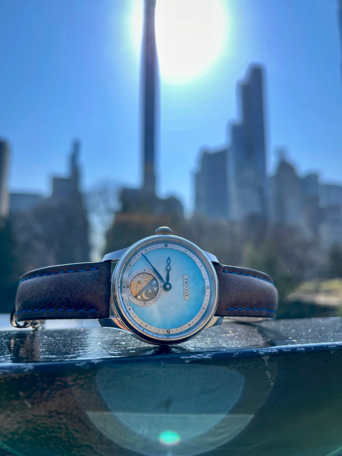
At this point, this was definitely one of the more expensive Indies I’ve purchased and so I was nervous that I was just throwing away money – once I got the watch, that notion was quickly brushed aside. The Bluebird builds off the standard K2. Starting on the dial side, the blue truly does remind me of those crisp cloudless days, with a slight lightening towards white in the middle. Otherwise, the engraved 24 hour indicator is the same- with a sun in yellow gold on half, and a moon and stars on the other half. The relief in the engraving is deep and gives a lot of texture, with a small gold arrow on the night side pointing at the time on a 24 hour scale. The blued hands are organic and provide plenty of contrast against the lighter dial making for easy time reading.
The case itself is probably the only place I’d offer some criticism. While the stated specs are that the watch is 10.7mm tall, that might be only the case as the crystal stands proud of this. Given the rather tall midcase, it does wear a little tall. While it does fit under the cuff, I’d say I’ve noticed it doesn’t slide under super easily. The lugs taper down nicely to enhance wearability, but I definitely suggest a nice padded strap for it due to where the lug holes are in relation to the case. While the stock padded brown strap with contrasting blue stitching is quite nice, I’ve been wearing it on a padded Dangerous9 strap as pictured. The large onion crown is quite easy to grab and wind- especially important given it’s a manual wind movement – and the physical feedback feels quite nice in winding.
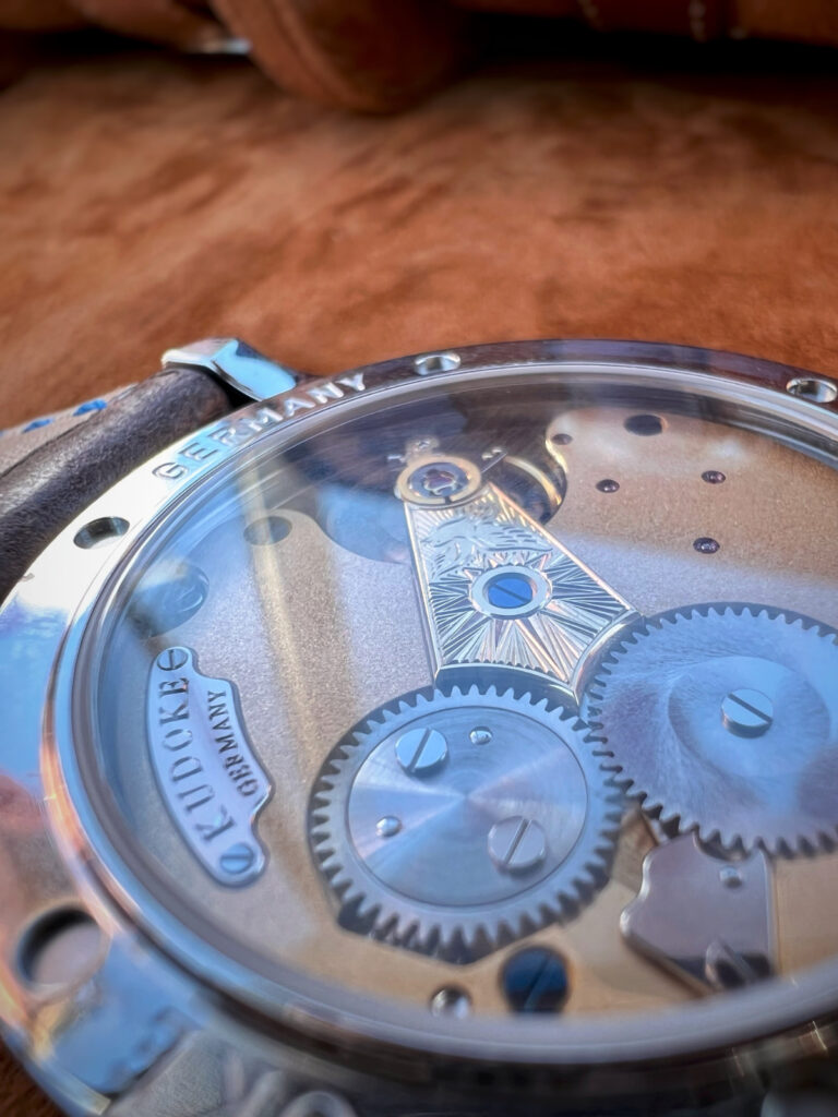
The movement, dubbed the Kaliber 1, is just a fun to look at as the front. While the majority is gold plated frosted, the balance is engraved with a little bird flying across, with a sunburst pattern behind it. Much like the other engraving on the front, the engraving is nice and deep making the bird really pop. And then all the screws are heat blued also adding a little additional color to the movement.
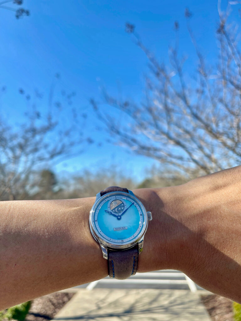
The light airy blue dial just cheers me up each time I look at it on my wrist and I’m glad I took the leap and added the Kudoke 2 Bluebird to the collection.
Pros
The eye-catching blue dial that’s super dynamic based on the light
A back that is as fun to look at as the front
The feel in winding the movement
Cons
The watch is a little thick, especially as the midcase is quite slab sided.
Everyone asks if the 12 o’clock subdial is a moon phase, and I have to explain its just a 24 hour indicator
Not so much a con, but it could have been interesting if there was some lume on it
Quality
97
Style
97
Value
93
Wearability
92

Leave a Reply
You must be logged in to post a comment.