I used to know a guy called Christopher at school. Nice chap, great at football. Whenever I look at this Christopher Ward C65 Sandstorm Blackout I think of him though! Which is okay but not what I expected to feel when I picked this up. Is it because Christopher Ward is spelt out on the dial? It’s always been mine and many other enthusiasts bug bear with their watches, why can’t they just utilise the excellent embossed logo? Well known, adorns all their crowns and would look so much better.
I think that’s why (narrowly minded) I have in the past dismissed many of their watches due to this graphical oversite. Stupid, isn’t it?
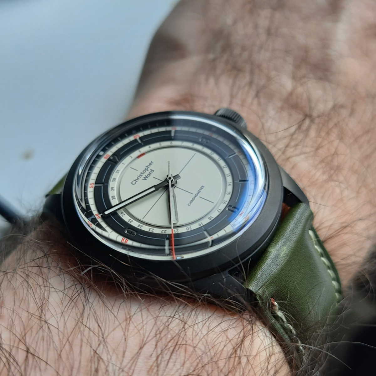
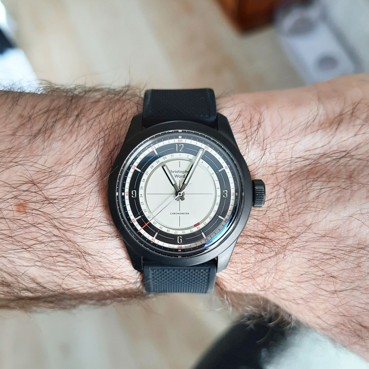
I have come to my senses though with this unique Christopher Ward C65 Sandstorm Blackout, a watch publication, Worn and Wound, collaboration that debuted a couple of years ago. From an aesthetic standpoint, CW have always produced unique and frankly gorgeous looking watches, from their C60 Trident line to the C65 Super Compressor. And this Christopher Ward, marketed as a field watch continues with a unique sector dial layout with oodles of depth. From those contrasting rings of cream and black to the focal point sunburst effect black ring incorporating punched out numerals at 12,3,6&9 to a quite brilliant pointer style date layout. It really is a marvellous dial. Just being able to see the shadow of that red tipped seconds hand on the cream dial is a lovely. There is always something to discover everytime I look at it.

Admittedly the Christopher Ward C65 Sandstorm Blackout design has split opinions and is still available for sale even though it was limited to just 100 pieces, so make of that what you will, but the choice of contrasting colours historically would always do that to watches, I think. I love it though and its easily my most worn watch of this year so far.
The ‘light catcher’ case (a stalwart of many CW watches) is also a triumph, complex geometry gives a short and taught 38mm diameter by 45.3mm lug to lug, with a depth of just 11.6mm. It hugs my flat wrist effortlessly. It’s beautifully made with the matte black DLC coating willing to show up any flaws (there aren’t any). Thus, I cannot fault CW’s attention to detail and quality control, it’s a faultless timepiece, and with the company’s 5 year guarantee they are rightfully confident in their product.
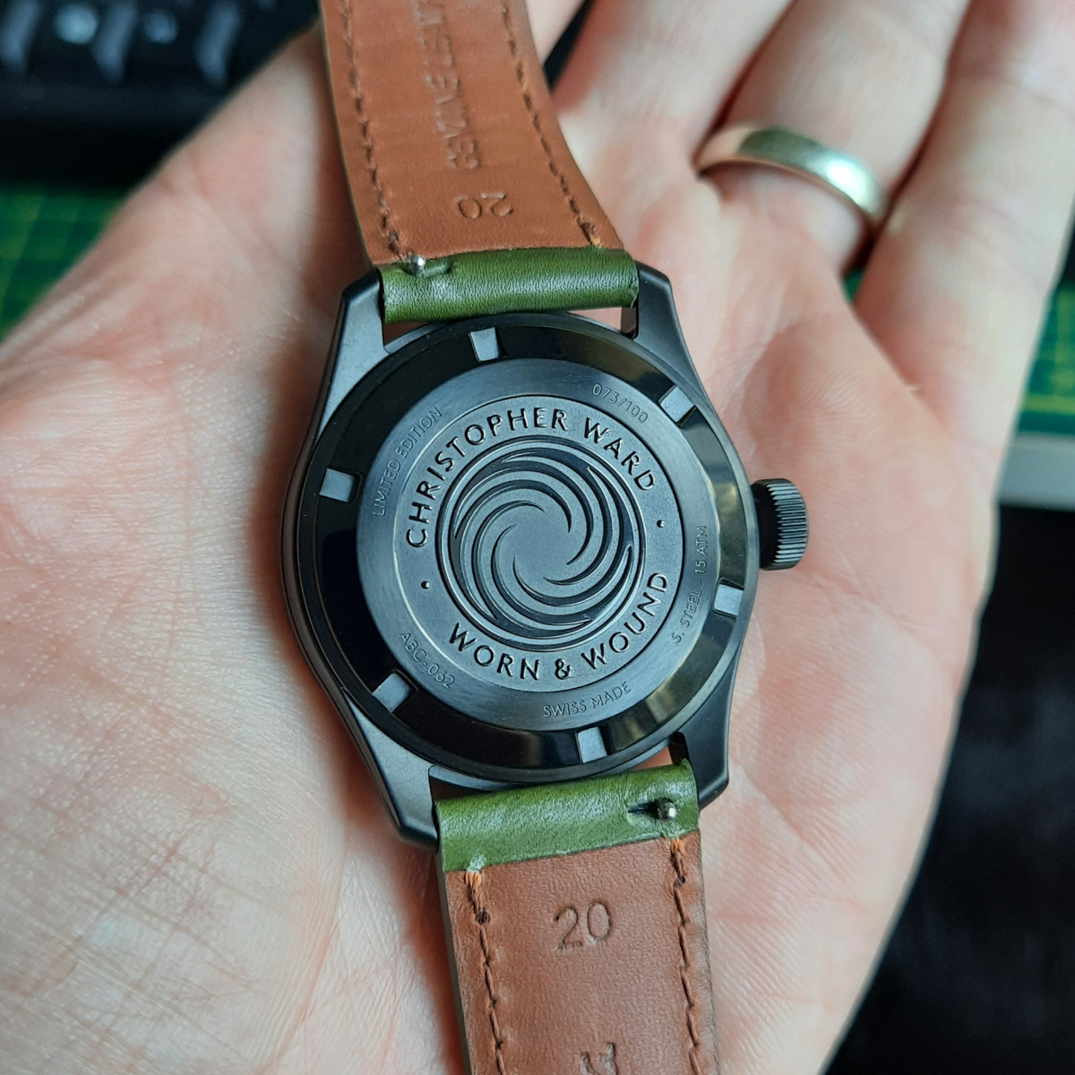
Inside this marvellous Christopher Ward C65 Sandstorm Blackout is a COSC certified Sellita SW200, rated to 150m of water resistance. Again nothing out of the ordinary and I’m happy at this price point to know that’s the choice movement and a chronometer grade at that. Time setting and adjusting is a breeze with the well thought out crown, -lovely size and grip- with two details that are a nice touch, that embossed logo and a thin red metallic ring linking to the small numerals around the dial’s outer edge. And shock horror! When screwing the crown in the logo lines up correctly (parallel with the plane of the dial/crystal) still don’t see this on more than enough watches.

From a practical standpoint though that’s where my gushing stops, its not so good. That pointer date layout is small and thus hard to read at a glance and in low light. Lume is minimal and general shadowing of the dial hinders the appearance of that sunburst black ring, so getting a quick read on the time can be troublesome. And due to the hands having a slight polished, chamfered edge adds to the legibility issues. Swap those hands out for some flat faced ones and that’s solved.
Supplied strap on the Christopher Ward C65 Sandstorm Blackout is okay, stiff but keeps the overall theme of the watch, I would advise to swap this out as it will work with many strap options.
Finally a note on packaging. The best I’ve experienced. Attention to detail again is first rate. Right down to small magnets in the outer box case to ensure both boxes stay together. The whole concept is unique and works across their entire range. Some use of sustainable materials is applauded.
Maybe I should get back in contact with Chris?


Leave a Reply
You must be logged in to post a comment.