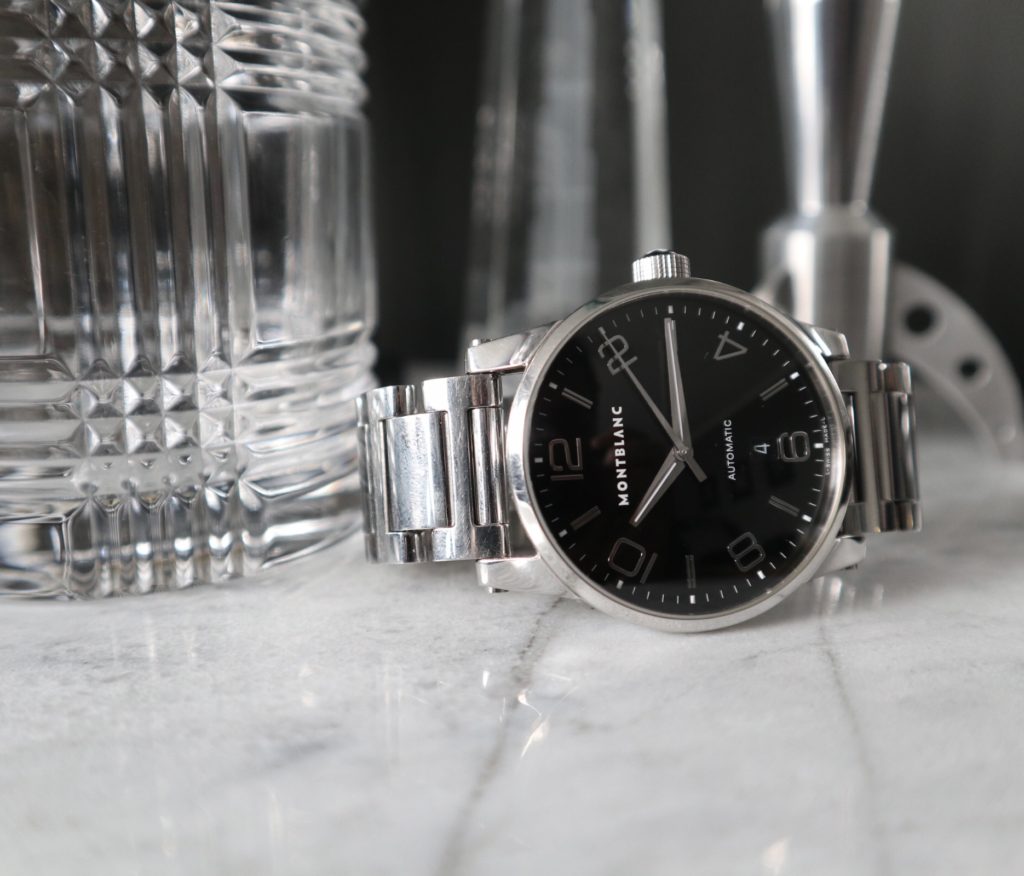
The Montblanc Timewalker was my first grail watch and the “one” that I absolutely wanted, but thought I could never get (now I have two!). The Montblanc Timewalker has three “generations” of models. This is from the first and original generation; from the mid-2000’s. The Montblanc Timewalker was designed by Giampiero Bodino, the man who was partly in charge of the Panerai rejuvenation. Judging by its designer and looking at the watch it’s clear that the brand wanted to create a beautiful and visually intriguing piece.

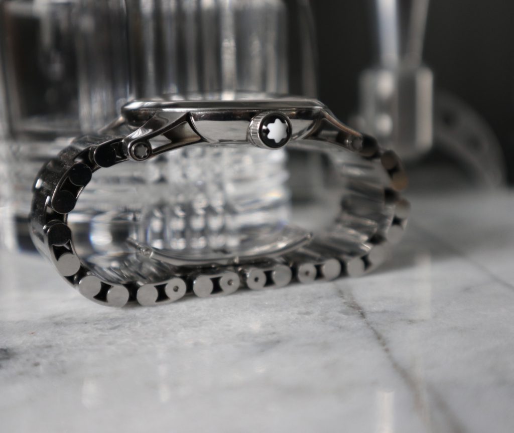
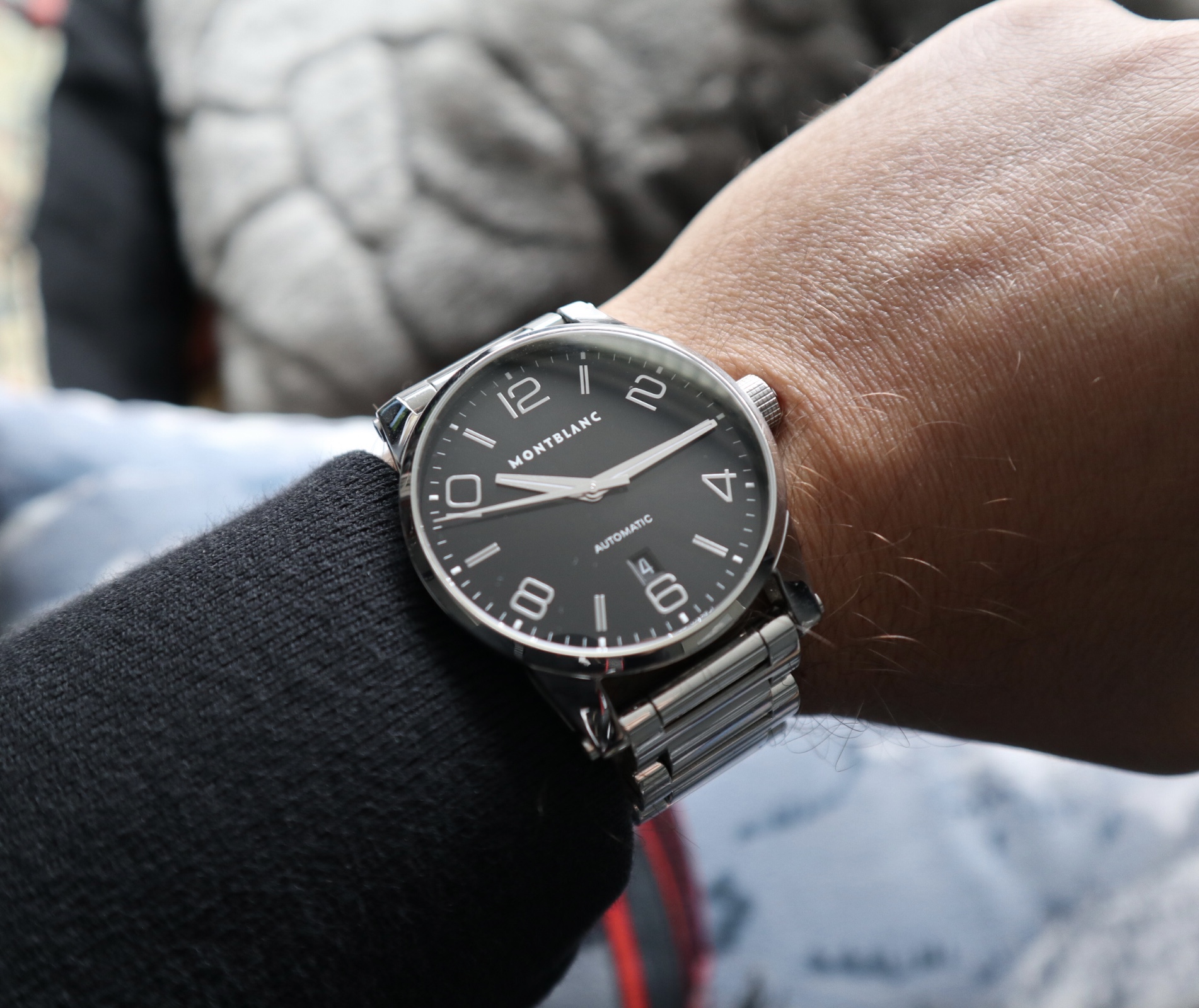
Looking at the watch top-down, one will immediately notice the distinct typeface. This font has become a Montblanc Timewalker staple through all its generations. The hands are quite angular, with a slit for lume, and tiny lume plots at each hour marker. This watch must be handled in person to be truly enjoyed. The skeletonized lugs feature a satin finish on the inside, while the rest of the case has a mirror finish. The lugs feature small logos as design cues on the “screw head” where the bracelet connects to the case. The skeletonized lugs enhance the look of the wok-shaped case. The crown is substantive with an etched grid pattern, capped by the Montblanc logo. The uniquely-styled bracelet is heavy and skeletonized. This watch has presence on the wrist, without being too flashy. No part of this watch is an afterthought.

The movement in this generation is the dependable ETA 2892 (A-2 variant I believe) found in more expensive watches than the Montblanc Timewalker. The other generations are still well designed but have features that were changed to lower production costs. Gone is the 2892A-2, gone are the skeletonized lugs, bracelet, etc… This is the watch that receives the most compliments from normal (i.e. non-watch) people, goes well with a variety of straps, and just seems to fit-in well in any circumstance.


Leave a Reply
You must be logged in to post a comment.