I came across Oak & Oscar on the web and was immediately attracted by the exceptionally well balanced design of their watches. I can hardly buy a watch I’ve never seen in the metal, but it happened when Oak & Oscar’s Chase and John (very nice guys btw!) hosted a GTG in Frankfurt!
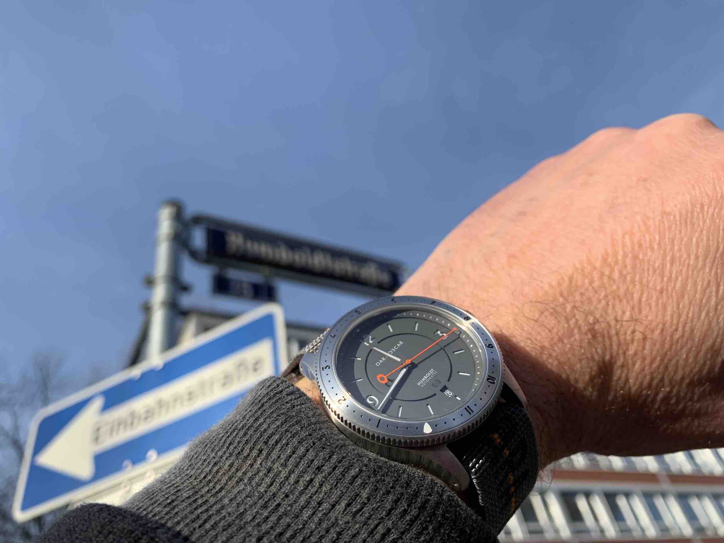
I tried on several watches, but the Humboldt quickly gained my interest. Not because of the German name, but because of the bezel. Not too prominent, well integrated into the case and with 12 hour markings. It can be turned with just the right amount of force applied and has a minimum amount of backplay. After two hours (and two or three drinks) I knew I needed to have my own Humboldt.
Even months later I am still excited by the many details of the watch. It starts with something as simple as the colours. I have chosen the grey dial, which looks cool and kind of natural and matches the orange of the second hand. The latter reveals a lot of the design philosophy: An unusual form, but very practical and nice to look at. The counterweight is not only the logo of the brand, it also matches the logo on the dial exactly, when the hand is at 12. Did you notice the hammerhead-type of tip? It also just reaches the rehaut. I like, if the rehaut is not just «there», but has a purpose. On the Humboldt it’s used for the minute dots.
And, yes, the date of the Humboldt is coloured white on grey just as the rest of the watch, it seamlessly integrates into the dial. Just the way I would have made it. The dial itself is actually a sandwich construction, which gives lots of lume and adds some really nice depth to the look. The sandwich dial is one of the reasons why Oak & Oscar did choose an ETA 2892, as with other, cheaper, movements, that watch would get too thick to look good.
To summarise: I could easily recommend buying an Oak & Oscar without seeing it first …


Leave a Reply
You must be logged in to post a comment.