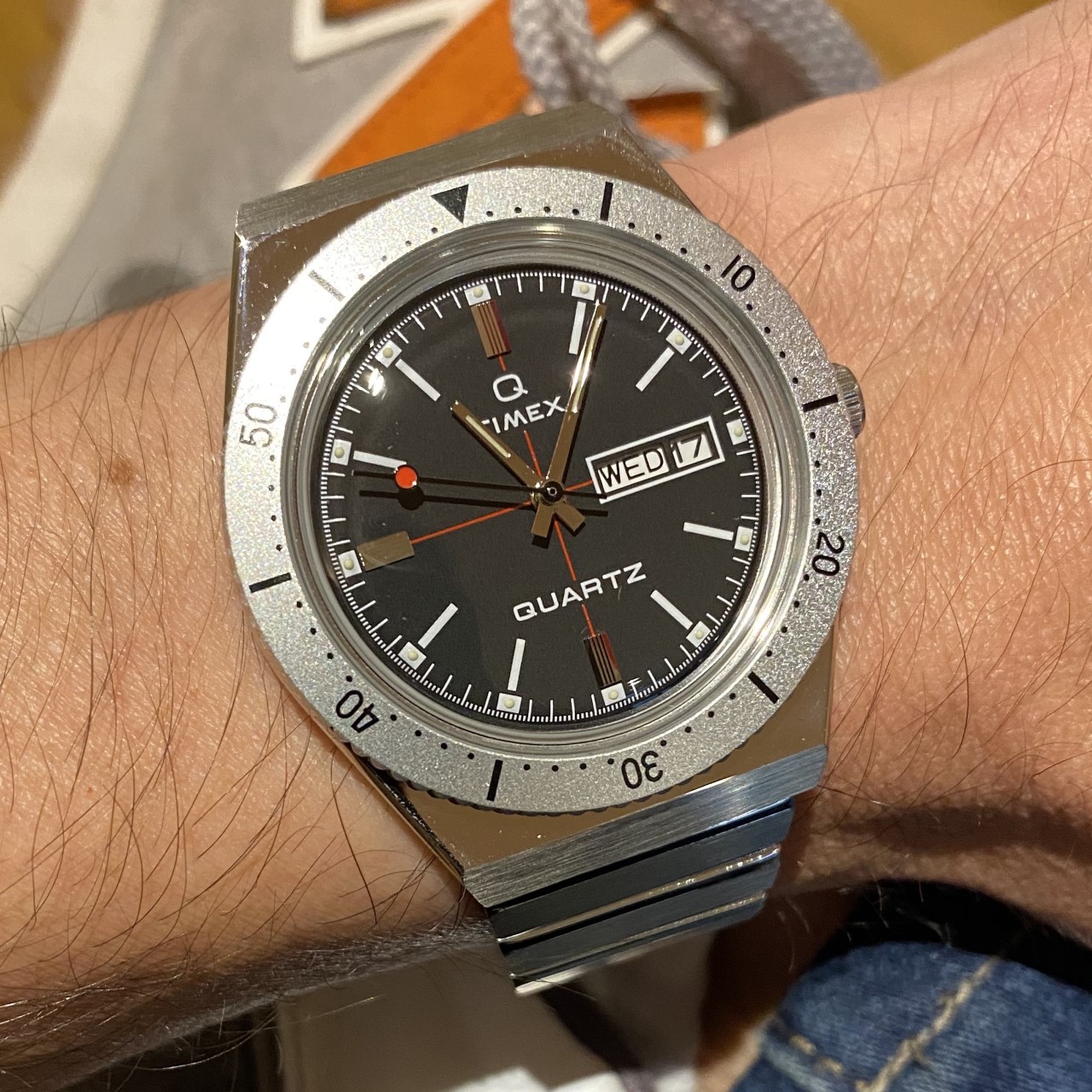
I L.O.V.E. THE LOOK! Fine red cross-hair on the dial, red dot on the second hand (Japanese quartz movement dead-beat haha), strong 70s typography, great looking bezel, and that domed acrylic crystal is PER-FECT. So much of this watch ‘looks’ perfect. The case and bracelet design is super modern, but the execution looks a little cheap, especially the bracelet which feels cheap as it weighs nothing, and also catches the occasional wrist hair – ouch. However, with an 18mm lug width, I’ll be able to try it on various straps.
I can’t stop comparing this Timex Q with the Autodromo Group B as it has a similar design aesthetic, but not the manufacturing which is no surprise given $1000 v $300. However I also look at the quality that Dan Henry watches provide for $400-500, and the Timex is lacking in comparative quality. As much as I love the design of the bracelet, I assume the quality of the other Q Timex bracelets are better and would look good on this watch head also.
Finally, the watch looks great to wear on the wrist with work or weekend wear. It is quite low in profile at 11.5mm thickness (unsurprisingly for a quartz). The bracelet links are very adjustable as is the clasp, and it looks like you can change your own battery with a five cent coin.


Leave a Reply
You must be logged in to post a comment.